Barcelona, Spain. 28th October 2018.
Subscribe, Search, Recent Posts and Top Posts are at bottom of page. (Trip summary and links to posts.)
The equivalent colour post with more images and more information including historical context is Casa Batlló.
.
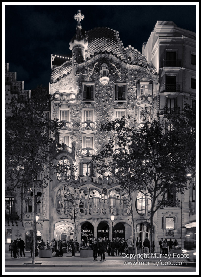
We are arriving at Casa Batlló for an evening visit.
.
.
.
. 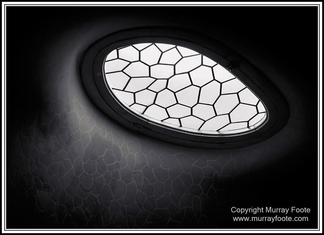
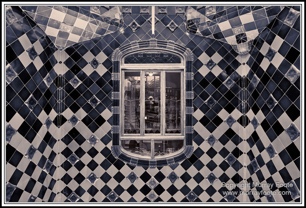
A light well in the ceiling.
.
.
.
. 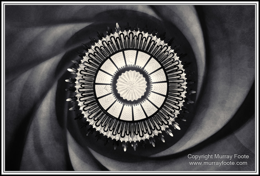
Main light source from the feature room on the ground floor.
.
.
.
. 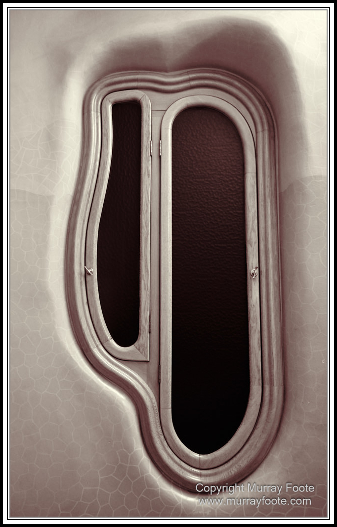
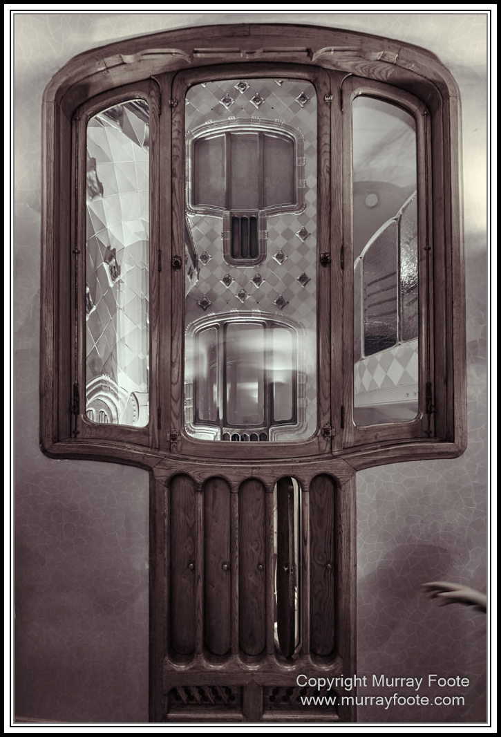
Internal windows.
.
.
.
. 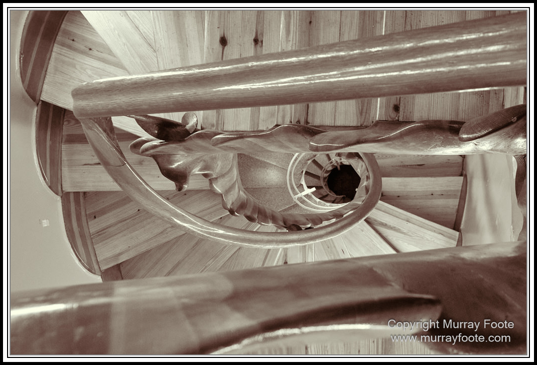
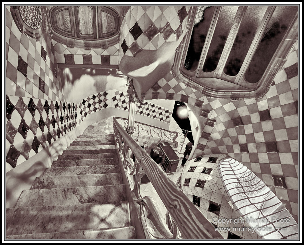
Looking down a staircase.
.
.
.
. 
Looking through to the Atrium; windows and vents mirrored front and back.
.
.
.
. 
An artistic triumph at the top of the stairs.
.
.
.
. 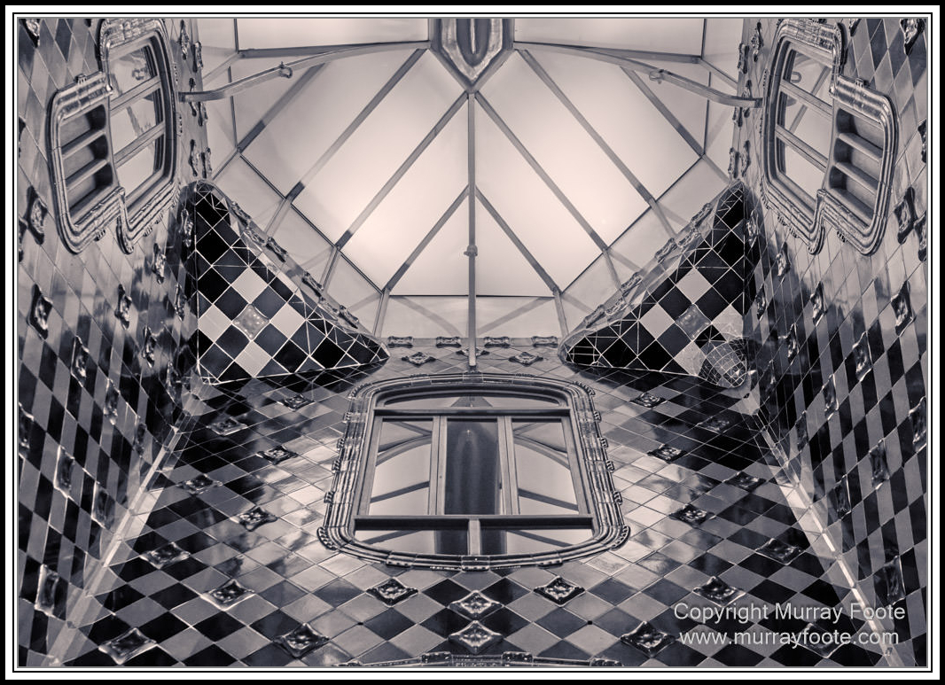
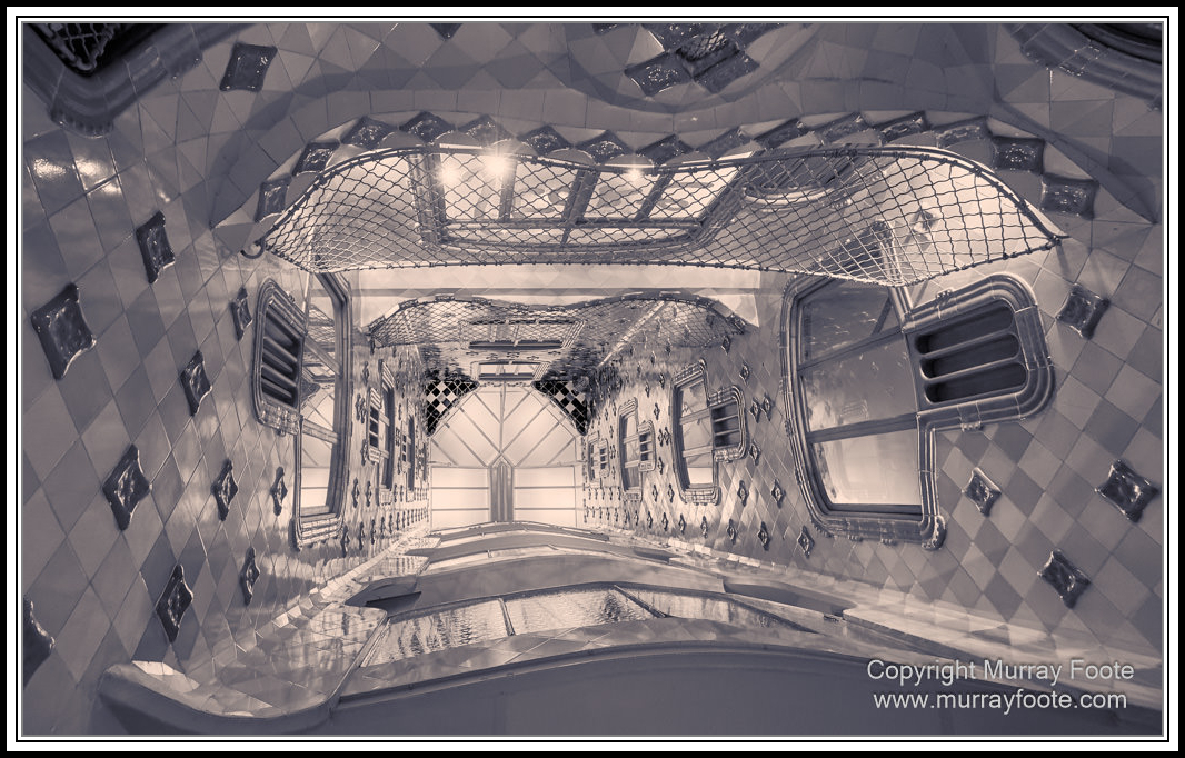
Looking up in the Atrium.
.
.
.
. 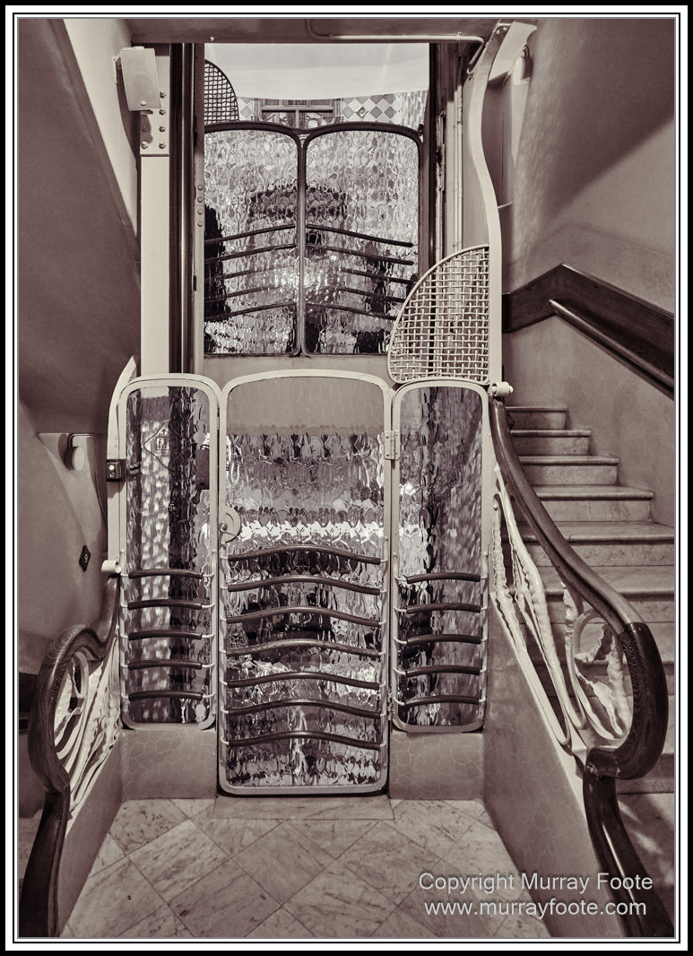
Lift well.
.
.
.
.
inside the Atrium.
.
.
.
. 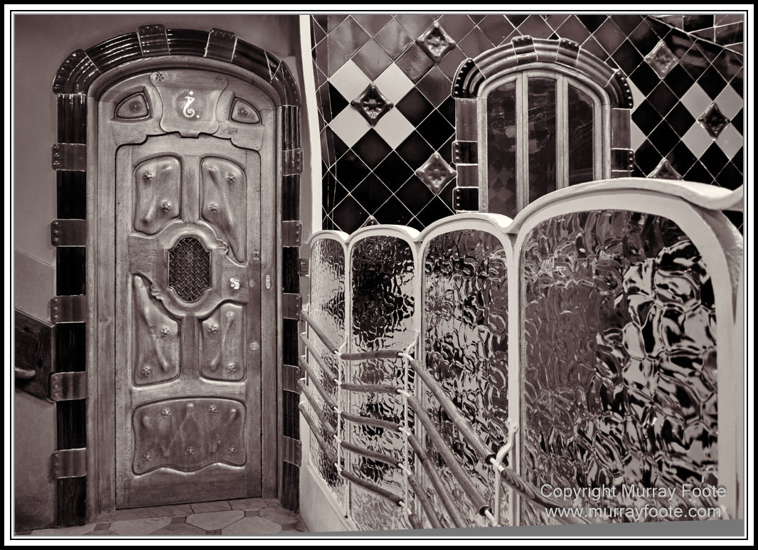
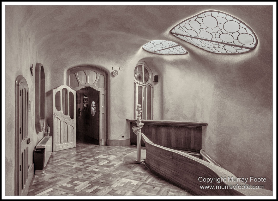
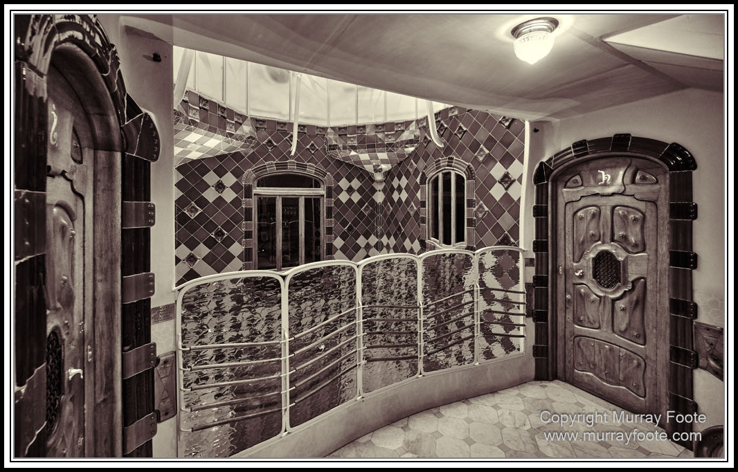
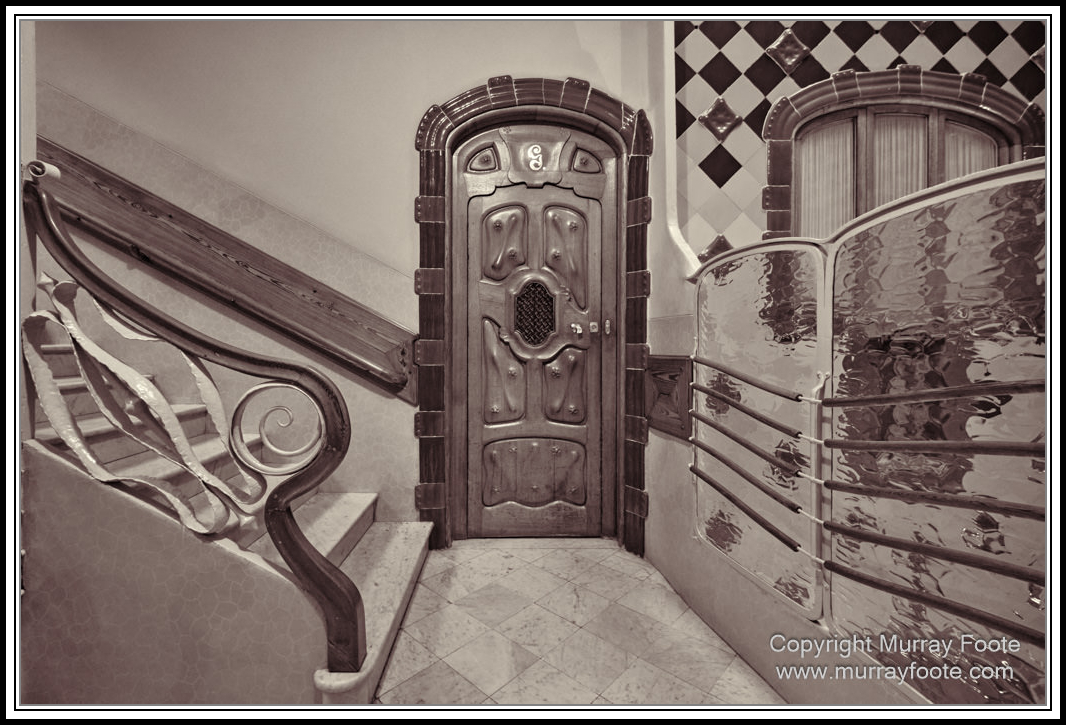
Door beside the Atrium.
.
.
.
. 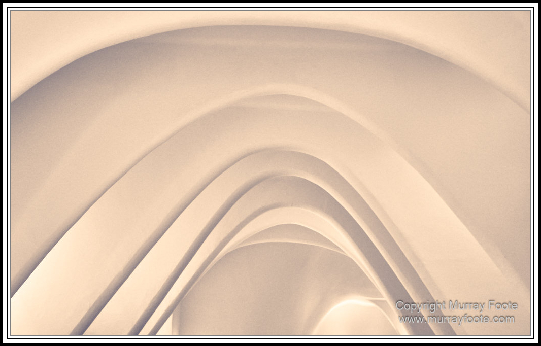
The arches of the Loft, originally a service area.
.
.
.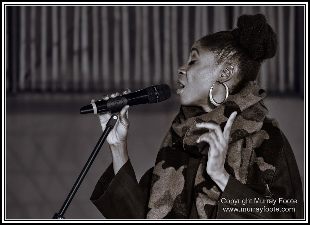
Marga Mbande.
.
.
.
. 
Marga Mbande.
.
.
.
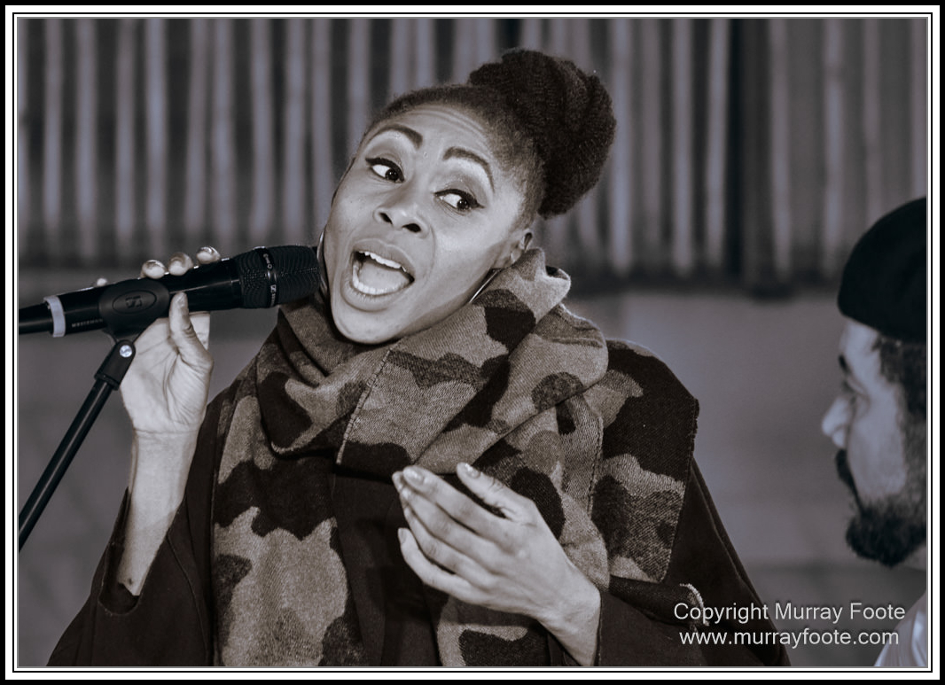
Marga Mbande in concert.
.
.
.
. 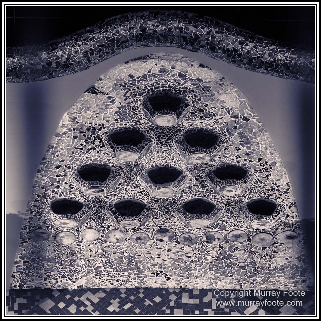
Gaudi decoration on the roof.
.
.
.
. 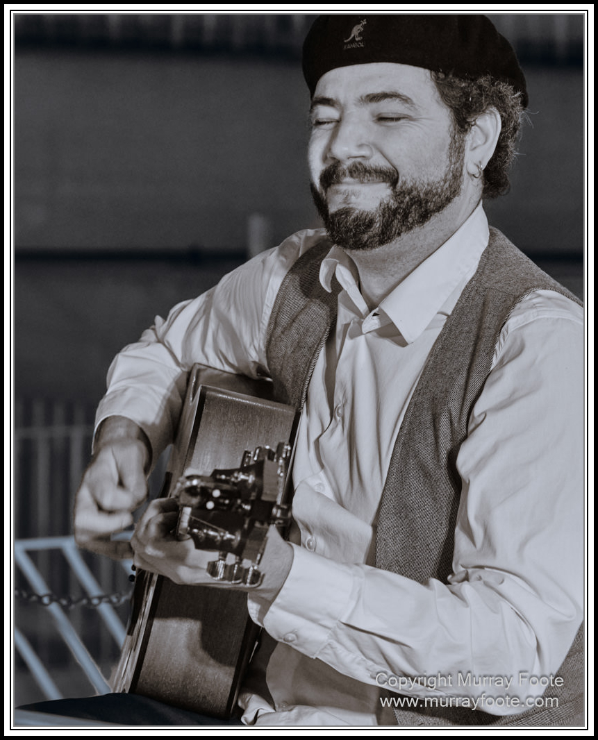
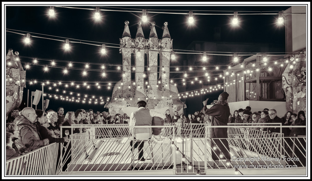
Marga Mbande’s guitarist.
.
.
.
. 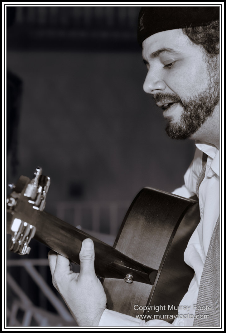
Marga Mbande’s guitarist.
.
.
.
. 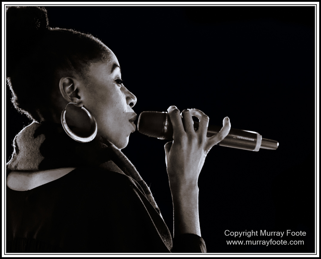
Marga Mbande.
.
.
.
Walking back down. It’s the same route but things can look different going the other way.
.
.
.
. 
Somewhat similar image earlier; different door, floor and details.
.
.
.
. 
Looking down stairs.
.
.
.
. 
Looking up through the Atrium.
.
.
.
. 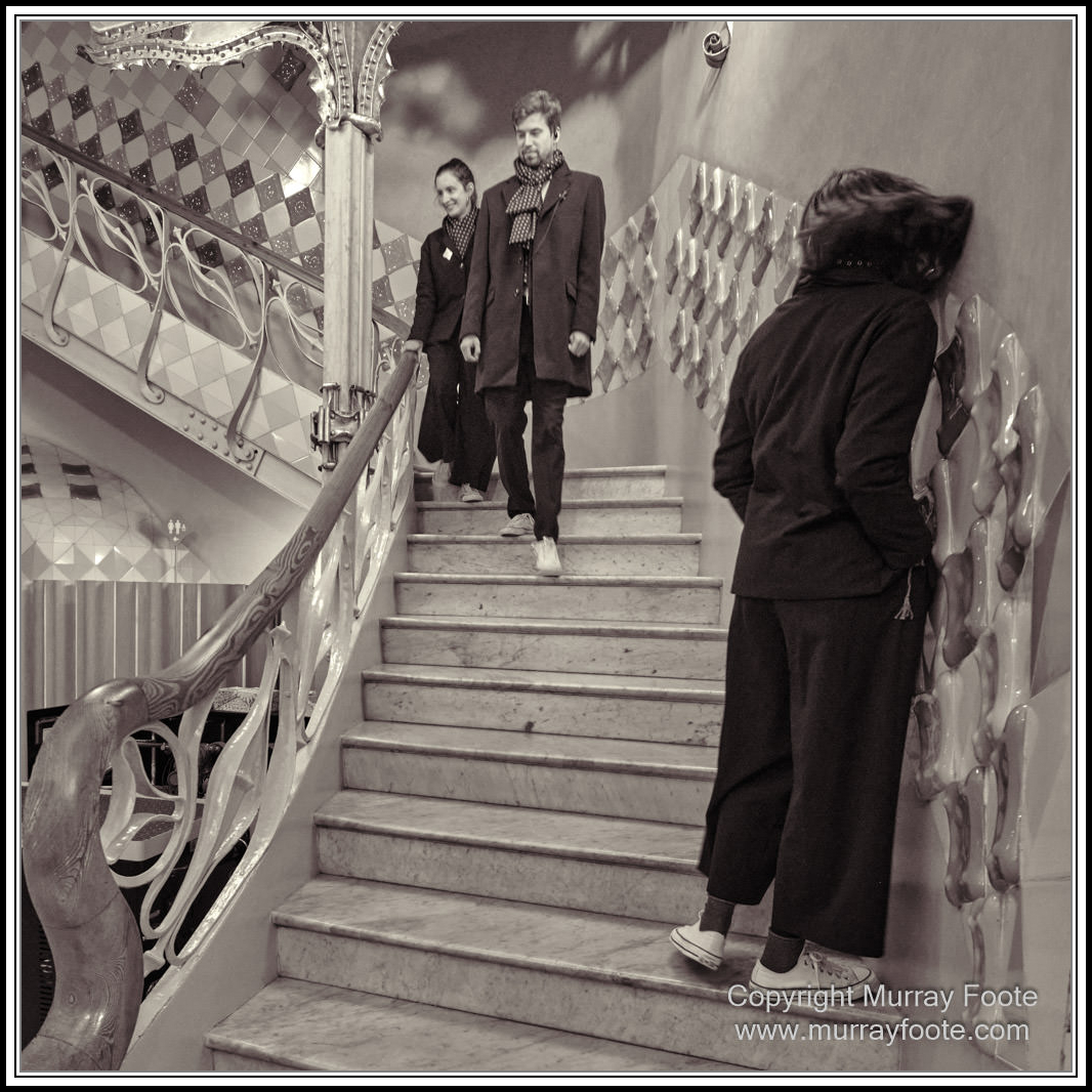
The dangers of gluing oneself to a wall.
(All the guide books warn against this).
.
.
.
.
You can have black and white images or monochromes (single tone) or duotones (different tones for highlights and shadows. You can also have tritones and quadtones, where either three or four colours are assigned to different tonal ranges. In the pre-digital world, duotones to quadtones were mainly commercial printing techniques and possible but quite difficult in the darkroom. In the digital world it gets much easier but as with anything in Photography, it doesn’t matter how hard or easy it is to do, the only relevant question is “How well does it work”?
All of these images start off as duotones but they are not all the same treatment. While there’s a case for processing all images in a post the same way, this is not what I have done here. The people images have blue highlights and orange shadows. The images with wood doors etc have yellow highlights and red shadows. The images with wall tiles have orange highlights and blue shadows. It’s generally supposed to be subtle though the colours can look quite different where the dominant tones of images vary.
Half of the images actually have four tones applied. Whether that makes them duotones is a moot point because I have done it regionally, not globally. In most cases you probably won’t notice.
.
My attitude is also not to compare them with the colour images, that’s a different world.
.
